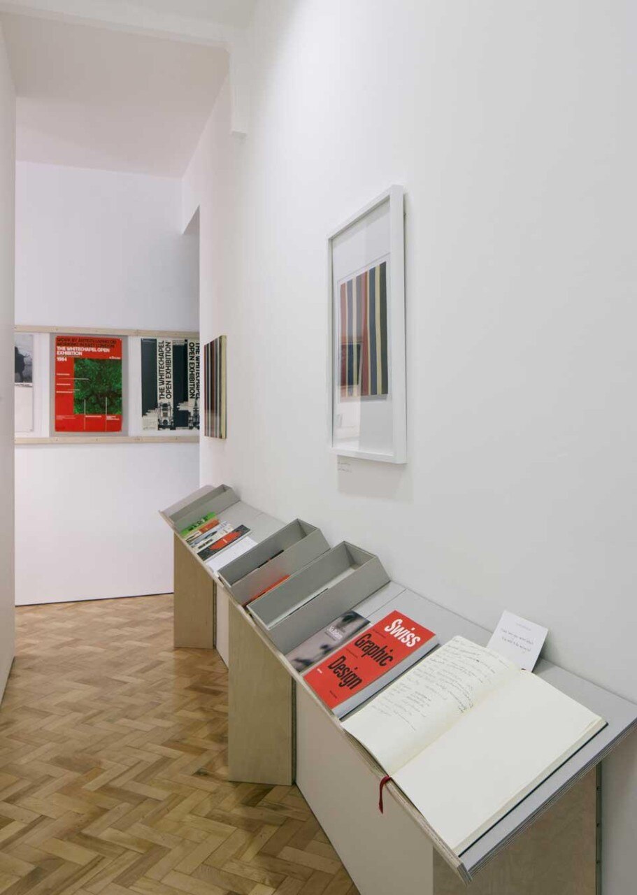
Richard Hollis

Displaying over two hundred items from the designer' personal archive, an exhibition at the Gallery Libby Sellers is the first real insight into the process, practice, and personal values of one of Britain's most influential graphic designers.

What do Steve McQueen, the Whitechapel Gallery, John Berger's Ways of Seeing and Graphic Design: A Concise History all have in common? The answer is they have all benefitted from the contribution of the illustrious Richard Hollis. One of Britain's most influential graphic designers, Hollis has been active as a practitioner, educator and author since the late 1950s, and yet his work has so far remained little known outside of the design community.

This relative anonymity looks set to change thanks to the current exhibition at London's Gallery Libby Sellers, the first to be devoted to the designer. Consisting of over two hundred items drawn from Hollis's personal archive, including his books, letterheads and posters, personal correspondence and postcards, this is the first real insight into the designer's process, practice, and personal values. What it reveals is how closely connected these all are.

As much with of Hollis's work, the exhibition is a collaborative effort. Sellers had invited Emily King, a design historian specializing in graphic design, to curate a graphic-based offering to parallel the V&A's British Design summer show. The architect Simon Jones designed the exhibition, while the gallery guide is the work of the graphic designer Sara de Bondt. De Bondt is also responsible for About Graphic Design, a collection of Hollis's writings recently published by Occasional Papers.
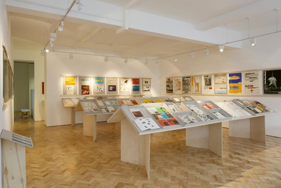
<em>Richard Hollis</em> at the Gallery Libby Sellers, installation view
Richard Hollis at the Gallery Libby Sellers, installation view
Together, they have produced an exhibition permeated by Hollis's approach to design; one characterized not by style, but clarity of communication and what King describes as an "insistence on using text and image together to maximize meaning". Hollis's influence is most evident at the beginning of the exhibition, which mirrors the experience of reading Ways of Seeing. Published in 1972 by Penguin Press, Hollis was part of a team responsible for the book's design, whose revolutionary layout was seen as seminal as the television series it accompanied. Just as the book's front cover is actually its opening page, so the first case is placed in the gallery's window, which the visitor encounters from the outside — a clever bit of curation only marred by the fact that you can't get close enough to the window to see the display properly.
<em>Richard Hollis</em> at the Gallery Libby Sellers, installation view
Richard Hollis at the Gallery Libby Sellers, installation view
The rest of the exhibition is divided up into four loosely chronologically ordered rows that extend the near-width of the gallery. The display cases are similarly informed by the designer's Spartan sensibility; made out of greyboard and plywood, the flatpack, folding design demonstrates the same economy of materials and technique that informed much of Hollis's work.

Amongst the earliest items on display are photographs from his travels to Cuba and North Africa in the early 1960s. These trips, as well as those to Zurich and Paris, deeply influenced his work; both in terms of his early passion for Swiss Modernist design, as well as his engagement with the wider socio-political context. Hollis saw design as a "social service", and he lent his skills to a number of causes: the exhibition contains works for the CND, New Middle East and New Society magazines and for the leftwing Pluto Press. Amongst his designs for the latter was the book cover of Patrick Kinnersely's 1973 The Hazards of Work, whose use of tabloid-style typography and size — it was designed to fit into the pocket of a worker's overall — illustrated Hollis's desire to produce as accessible a text as possible.
Here is an exhibition permeated by Hollis's approach to design; one characterized not by style, but clarity of communication and what King describes as an "insistence on using text and image together to maximize meaning"
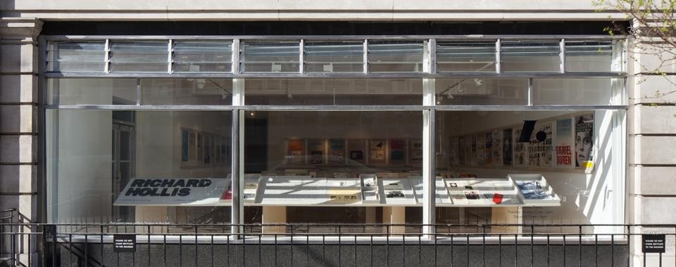
<em>Richard Hollis</em> at the Gallery Libby Sellers, installation view
Richard Hollis at the Gallery Libby Sellers, installation view
The exhibition reveals insights into the designer's approach in other ways; sketches and scribbled-over proofs reveal the amount of attention paid to the minutiae of design decisions and the manual nature of graphic design in the pre-digital era, while correspondence with clients reveals the collaborative nature of much of this decision-making.

A significant proportion of the exhibition is given over to the collaborations with artists and art organizations that Hollis has long engaged in. Dominating the posters that line the gallery's walls are those that Hollis did for the Whitechapel Gallery from the late sixties to the early eighties, while the display cases contain Hollis's most recent collaborations, such as 2010's Queen and Country project with Steve McQueen.
Exhibition poster for <em>The Sights and Sounds of the Jewish East End</em> at The Whitechapel Gallery, London. Design by Richard Hollis. 1980. Courtesy Richard Hollis.
Exhibition poster for The Sights and Sounds of the Jewish East End at The Whitechapel Gallery, London. Design by Richard Hollis. 1980. Courtesy Richard Hollis.
At the gallery's rear is a narrow corridor lined with items for sale, including a limited edition print of Hollis's work. It leads to a small room that contains a table of Hollis's publications for perusal, and a slide projector of his work with accompanying audio lecture. While this low-tech setup means that visuals and voice occasionally fall out-of-sync, ultimately this honest, unpolished setup is, according to both King and Sellers, characteristic of Hollis himself — a designer who saw himself as an "anonymous worker" rather than the star of the show. What this rich, hugely informative show suggests is that Hollis, who King describes as "the graphic designer's graphic designer", may no longer get his wish, as his contribution to graphic design is finally fully recognized.
Left: Book cover for <em>The Stagnant Society</em> by Michael Shanks. Design by Richard Hollis. Published by Penguin Books, London, 1961. Courtesy Richard Hollis. Right: Book cover for <em>Ways of Seeing</em> by John Berger. Design by Richard Hollis. Published by BBC and Penguin Books, London, 1972. Courtesy Richard Hollis.
Left: Book cover for The Stagnant Society by Michael Shanks. Design by Richard Hollis. Published by Penguin Books, London, 1961. Courtesy Richard Hollis. Right: Book cover for Ways of Seeing by John Berger. Design by Richard Hollis. Published by BBC and Penguin Books, London, 1972. Courtesy Richard Hollis.
Richard Hollis
Libby Sellers Gallery
Curated by Emily King
41-42 Berners Street, London
Through 28 April 2012
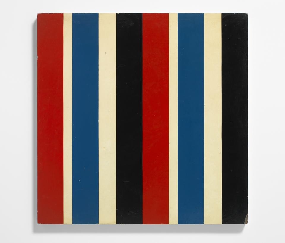
Richard Hollis, <em>Serial31323x2</em> painting
Richard Hollis, Serial31323x2 painting

Latest on Design

Latest on Domus

Read more
China Germany India Mexico, Central America and Caribbean Sri Lanka Korea icon-camera close icon-comments icon-down-sm icon-download icon-facebook icon-heart icon-heart icon-next-sm icon-next icon-pinterest icon-play icon-plus icon-prev-sm icon-prev Search icon-twitter icon-views icon-instagram