Yves Béhar for Nivea

On its 100th anniversary, the historical German brand gets a complete overhaul: Béhar and fuseproject sought to transform Nivea's typographical Bauhaus purity into something more contemporary.

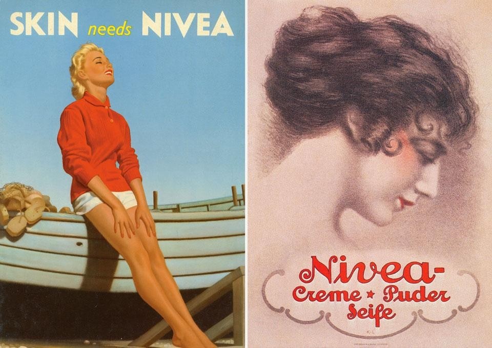
Nivea cream in its blue tin is undoubtedly one of the most iconic and most familiar of mass-produced goods in the world. From its somewhat Jugendstil origins in 1911, then with the 1925 redesign that introduced the blue tin with white lettering that reflected the spirit of Weimar, the jar of white cream has continued to evolve into a "gute form", absolute, almost abstract. To the point of becoming an archetype impressed upon the collective subconscious, if we want to bring in Jungian analysis. A survey in 200 places where the "blue tin" can be bought in the last century has shown that each consumer thinks it is a brand produced in their own country.

I confess that if asked point-blank, I would have said it was Italian. After I heard about the survey, I wasn't quite so embarrassed at owning up to this to Ralph Gusko, member of the Executive Board of Beiersdorf AG, at a meeting at the Hamburg headquarters last month. Gusko told us that even in Brazil, Nivea is considered a home-grown brand. In Hamburg they are proud of this appropriation and believe it to be one of the secrets of Nivea's success.

"The brand values", explain Gusko, "are founded on the quality of the cream, made to the same formula since 1922, that enjoys great trust among consumers". With a certain Teutonic understatement, the Germans don't care whether we know that the brand belongs to them, what they are proud of is "doing things well without talking about them too much". So well in fact that at the Hamburg factory they produce 500,000 jars a day, starting with the aluminium sheets for forming the container, printing the brand name, inserting the cream (also made here from raw materials), right up to packing it in boxes ready for delivery.
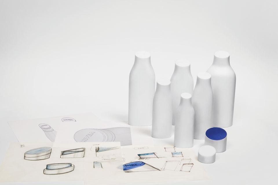
Top and abpve: Yves Béhar, Nivea redesign project
Despite this, the Nivea brand (that since the 1960s has also become synonymous with sun-cream), within an increasingly competitive global market has recently lost some of its strength.

A diversification of product lines and the lack of a single design direction common to all the lines has generated a multitude of bottles, tubes and dispensers in assorted forms (even experimenting with asymmetry), printed in different colours, with the logo on a rectangular background, waved, shadowed, often very difficult to spot amid the chaos of the supermarket shelves.
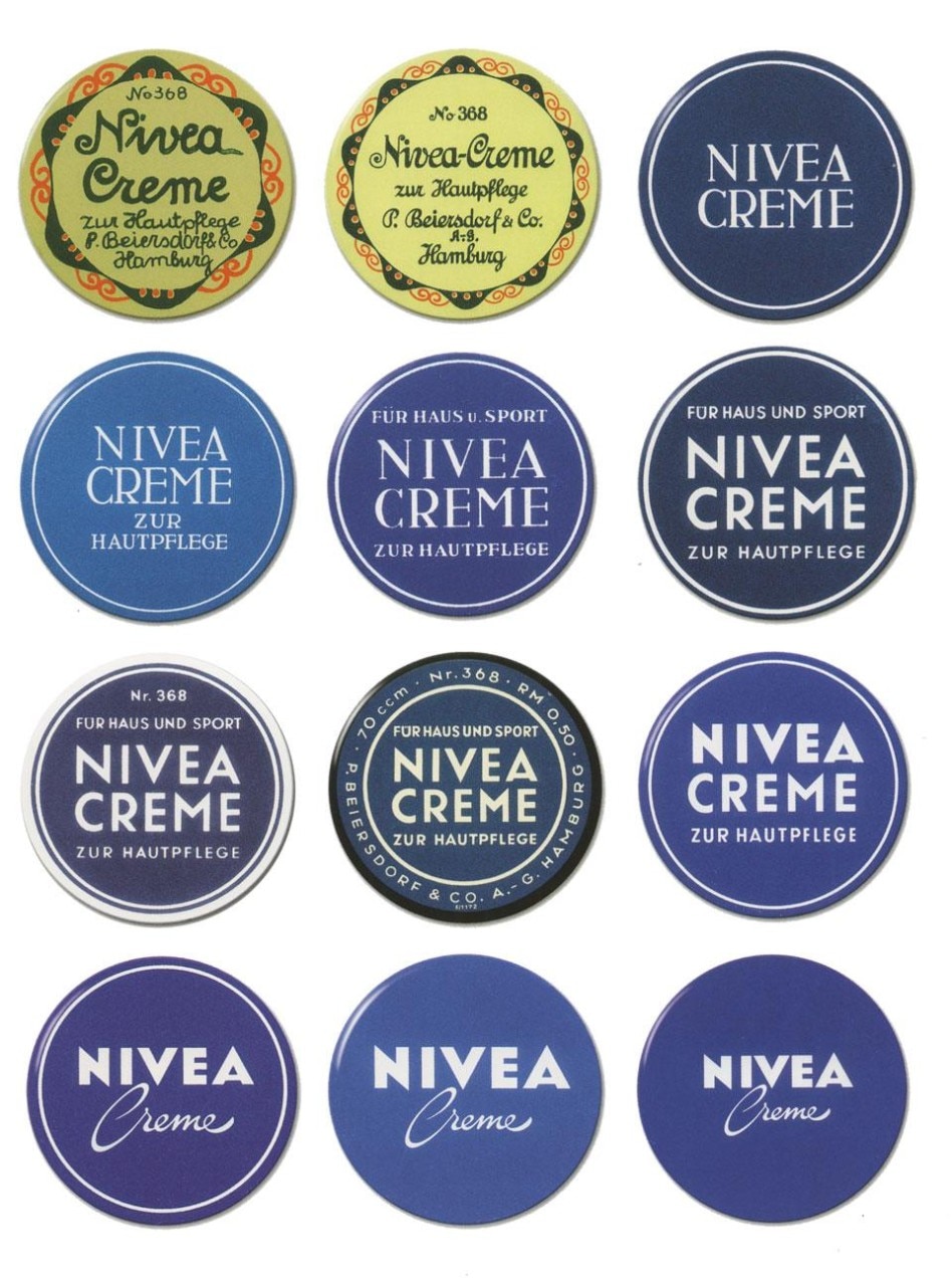
Evolution of the brand design from its origins to Yves Béhar's recent redesign
This loss of identity in terms of the image of Nivea products was starting to put at risk its commercial success and go against all the efforts regarding quality that Beiersdorf are constantly investing in.

For its hundredth birthday then, Nivea has got a new outfit, and the entire brand management and packaging design has been rethought. A single office has been created to coordinate the job of revising the look of the product leading towards a gradual unification and reinforcement of the brand image.

About a year ago, Yves Béhar and his Californian studio Fuseproject were chosen to work alongside the staff at Beiersdor AG of Hamburg on the design of a strategy that across various stages, beginning in January 2013, will gradually change the look of the Nivea products that we see on the shelves into a new and recognisable direction.
What remains close to the heart of this designer and what makes him proud of this collaboration is the sense of being part of a new trend that could redefine the role of industrial design
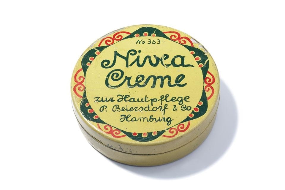
The original Nivea cream packaging, 1911
Yves Béhar, who I met in Hamburg at the presentation of the project, talked about the first meeting with the company that took place in New York last year. "What immediately emerged from the discussion was the importance of the history of the brand," he stated,"its long-standing ubiquity, the question that we asked ourselves together was how to return to that essence, how to translate the story into a contemporary product, looking to the future. We decided that the object could tell the story on its own, more than advertising, more than marketing. I think that today's consumer has developed a tendency towards a direct relationship with the company through a more sensorial relationship with the product. I asked myself: how can we convey the quality of the contents, how can we insert the typographical Bauhaus purity of the brand into something more contemporary, more up to date. I have to say that as far as I'm concerned, designing doesn't mean doing something new just for the sake of it but doing the right thing, that is different from doing something new. We started therefore with an analysis of the blue container. What was right was to take the original typography and rethink it in such a way that the blue circle with the white writing become the actual logo, bringing its value with it".
Left, Nivea poster, United Kingdom 1950. Right, Nivea advertising during the 1910s
Béhar's design also extends to the packaging, in an ongoing project that will unify all the lines over the course of a few years. Starting with the bottles of body lotion, the design is based on the extrusion of pure geometric forms, soft lines, that end with a neat touch that is the oblique cut of the neck on which sits the top.

"We have also worked hard on the sustainability of the container," Béhar explains. "The plastic is obviously recyclable, we have designed it to reduce the quantity of material, the dimension of the labelling as well as reducing space taken up by stock".
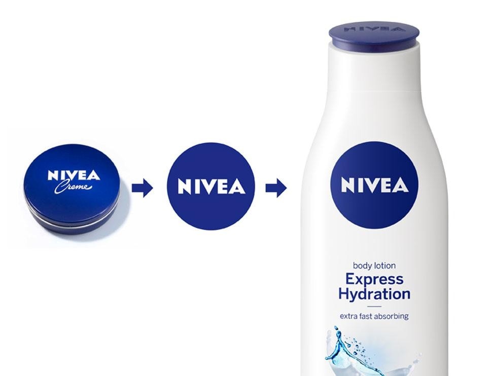
The new Nivea logo, redesigned by Yves Béhar
What remains close to the heart of this designer and what makes him proud of this collaboration is the sense of being part of a new trend that could redefine the role of industrial design: "here at Nivea they consider design to be at the centre of the world of consumer goods. It is still very rare to see good design in the supermarket, in the mainstream products that men and women buy every day. Instead, for me, this a very important place for good design to be in. I think that companies that mass-produce consumer goods should look more to design today because it can be more effective than advertising at conveying emotional content, a sense of product quality". Silvia Monaco
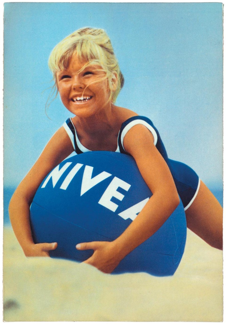
Nivea advertising, Norway, 1967

Latest on Design

Latest on Domus

Read more
China Germany India Mexico, Central America and Caribbean Sri Lanka Korea icon-camera close icon-comments icon-down-sm icon-download icon-facebook icon-heart icon-heart icon-next-sm icon-next icon-pinterest icon-play icon-plus icon-prev-sm icon-prev Search icon-twitter icon-views icon-instagram