In-screen sports graphics

The increasingly sophisticated visualisation of sports statistics can be extended to other fields, such as building or commerce, and help to improve the general quality of information.

This article was originally published in Domus 959 / June 2012

29 February 2012. I had just finished my talk at Strata, a large tech conference in California. I wanted to do that post-talk thing of answering a few hallway questions, having a drink of water and just recovering from the jarring but exhilarating experience of addressing an audience. But the speaker I most wanted to hear — Ryan Ismert — was directly after me and so I went to the back, sat down and listened.

Ismert's company, Sportvision, make the graphics that appear in US sports coverage, specialising in Baseball, NASCAR and American football. Ryan's title is General Manager for Augmented Reality, and his team decides how information graphics are integrated into the video feed. His talk at Strata discussed a variety of their products and the principles that go behind them.

I also make digital products that use data to engage and inform — some sports, some media, some business apps — and it's becoming increasingly clear that the idea of being data-driven is the core business, if not cultural, idea of our time. And interestingly, there might be ideas in the collection and depiction of sports data that ring true for all data-enabled businesses.

Sportvision is best known for the "1st and Ten" in American football. The 1st and Ten line is overlaid onto the TV screen during the game to show where a team needs to get to in the next play. 1st and Ten's innovation was to augment the viewing, and viewer understanding, in real time, as opposed to asynchronously in post-game analysis. This suggests a development in business intelligence reporting — where usually operations leaders can only get retrospective reports, rather than "realtime" data.
In the United States, the
Sportvision corporation
provides the graphics for
a large number of sports
broadcasts, in particular
for American football and
baseball matches as well
as NASCAR auto races
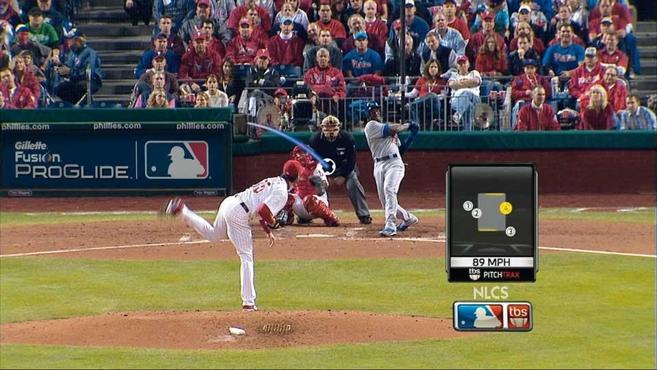
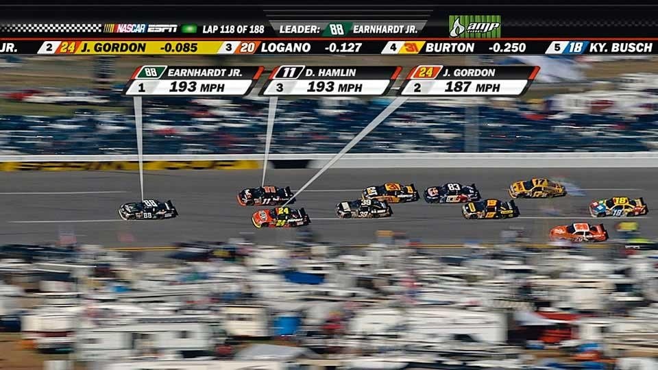
In the United States, the Sportvision corporation provides the graphics for a large number of sports broadcasts, in particular for American football and baseball matches as well as NASCAR auto races
The key point about 1st and Ten is the "magic" of showing the line occluded by the players who appear to be on top of it. It looks real and it looks painted on the pitch. It becomes seamlessly part of the experience — another layer of meaning on top of what the fans are already seeing. It is indeed a form of augmented reality, predating the likes of Google Glasses and iPhone apps by over a decade.

Whereas the visual design of 1st and Ten is a triumph of function and simplicity, many Sportvision products innovate as much in how the data is collected. This is best demonstrated in the work that powers their interfaces for baseball. Over and above their eyesight, baseball fans once had only one indication of the speed and direction of a pitched ball, measured via a radar gun. Sportvision then placed three cameras over the pitcher, enabling them to detect changes in the ball speed as it travels, as well as changes in direction, both crucial to determining the accuracy and consistency of pitchers. Their FIELDf/x tool can measure how far catchers' gloves move, suggesting the players' reading of the game. Sportvision's Chief Scientist Rick Cavallaro states that their aim was to show "things that are hard to see but important to the event".
<em><a href="http://www.nytimes.com/" target="_blank">The New York Times</a></em>’
infographics published on
4 February 2012 showed a
scaled representation of the
players and coaches most
mentioned during the latest
football season and, in the
bar chart, the number of
mentions per week
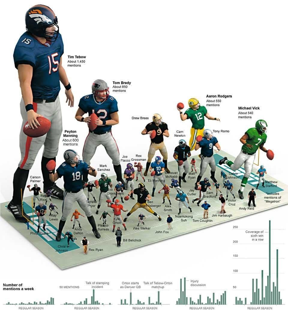
The New York Times’ infographics published on 4 February 2012 showed a scaled representation of the players and coaches most mentioned during the latest football season and, in the bar chart, the number of mentions per week
The in-screen graphics are perhaps the most impressive aspect of information design. Here, detail is minimised to show the accuracy of the pitcher in tandem with the sporting action. Data representations are stripped of all elements apart from those being measured — the box and the strikes — and the result is informative and balanced, beautiful in its economy. It seems to draw more from a fighter pilot's head-up display, honed through the intense performance criteria of life-or-death scenarios, than from the overblown 3D displays often seen on sports networks. Perhaps George Orwell's statement that "serious sport is war minus the shooting" was unwittingly a design-driver.

Yet how will this data-heavy approach translate to other sports, those based on more qualitative data, and what might this tell us about other arenas? How will it work for soccer — or rather, this being an Italian magazine and me being English, football. The performance of players in football is not hard to measure if you have lots of people to keep an eye on what is happening and report back. I have been lucky enough to work with Manchester City FC, and it is fair to say that little is missed by their analysts. Their reports will use a mixture of video, firsthand accounts and sports data from the dominant Opta and Prozone systems. Prozone in particular is virtually ubiquitous in football management, yet the notion of using data to support strategy in football dates back to the practice of "informational support" developed by Valeriy Lobanovskyi [1] when he was manager of Dynamo Kyiv in the early 1960s, as made clear in Jonathan Wilson's magnificently obsessive book Inverting the Pyramid: The History of Football Tactics.
By visualising a many-media mix of images, numbers, materials and opinion, the diversity of modern experience can be better expressed using the data around us
By
gathering and visualising
data in real time, viewers are
offered a more engaging and
direct experience of sporting
events
By gathering and visualising data in real time, viewers are offered a more engaging and direct experience of sporting events
Interestingly, video and firsthand anecdotal insight are the valuable ingredients here, more so than the basic physiological and movement data derived from tracking players. A game like football flows more than the American sports that Sportvision's systems serve, and is based on interdependent movement and relationships. It is more about systems than moments. According to Wilson, Lobanovskyi believed football was "less about individuals than about coalitions and the connections between them".

Even video struggles to capture this. Douglas Gordon and Philippe Parreno's portrait of French footballer Zinedine Zidane, based on 17 cameras tightly following his movement over the course of one match, reveals much about Zidane but very little about his team Real Madrid. Not that that was the artists' intentions, but it suggests that, even for a footballer as influential as Zidane, his relationship to the team's system remained elusive, beyond the capabilities of the bevy of cameras. Because of the constant movement of interlocking systems, it is fair to say that football has not thus far generated the wealth of data that US sports do.

The comic strip produced
for the British newspaper
<em>Sunday Express</em> during
the early 1970s by Danny
Blanchflower, a respected
Irish footballer and football
manager
The comic strip produced for the British newspaper Sunday Express during the early 1970s by Danny Blanchflower, a respected Irish footballer and football manager
American football and baseball both have short plays of explosive action, which are then picked apart instantly by fans and experts. A colleague once said that "American football is played on a grid". It's as if American sports are built to generate "quant data", which makes discussions around quantitative facts easier for the American sports fan. Could it be that the sports cultures of the new world are drawn towards "quant", whereas the games of the old world are more "qual"? This is overly simplistic. Note the existence of cricket for one thing, but also the tradition of literature associated with sports like baseball — remember the opening motif of Don DeLillo's Underworld, describing 1951's New York Giants vs. Brooklyn Dodgers game, and "the shot heard round the world". But there is no doubt that cultures of American and European sports are quite different, particularly in their presentation and discussion.

The wider freedom of movement in football, and those shifting rhythms, is richer and more unpredictable than in American football or baseball. Equally, football generates very few easily measurable facts. There are the moments when play stops — for goals or fouls — but the overall measurement of one team's or player's effectiveness is hidden in the combined movement of that team over the period of the game. Perhaps innately sensing this, it seems that football fans and governing bodies alike are reluctant to increase the measurement of their game, with the debate about goal-line sensors and GPS-chipped balls attracting as much hostility as support.
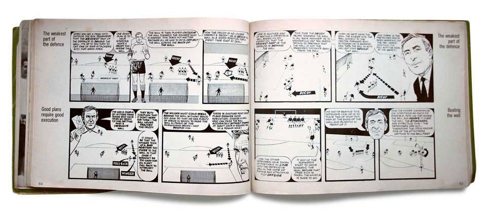
A detail of the comic strip produced
for the 
<em>Sunday Express</em> during
the early 1970s by Danny
Blanchflower
A detail of the comic strip produced for the Sunday Express during the early 1970s by Danny Blanchflower
This fluidity is typified by the current FC Barcelona team, who seem to play with no defined structure — rather a system of conditions, more like adaptive software than a prescribed series of plays. Such football is a daring balance of improvisation and discipline, learnt habits and individual brilliance in tension. Playing with a totaalvoetbal sense of selforganisation and improvisation, the team's so-called constant, rapid interchanges — with their midfielders often playing twice as many passes as the opposition's over 90 minutes — has developed into a genre of its own: "tiki-taka". Barça have proved notoriously difficult to beat, and analyse. Tactical intentions are disguised within the whirling patterns of play.

But this isn't just about the sports of the old and new worlds. There is a bigger picture, concerning how many of today's organisations are struggling to capture, visualise and use their data. For example, the management of built environments also increasingly depends on data gathering, with sensors generating data around footfall, temperature, energy use, building systems performance, and so on. These are the obvious aspects — often literally the "data-exhaust" of a building — but they are clearly only some indicators of the value of buildings. They do not tell the whole story of the life of a space.
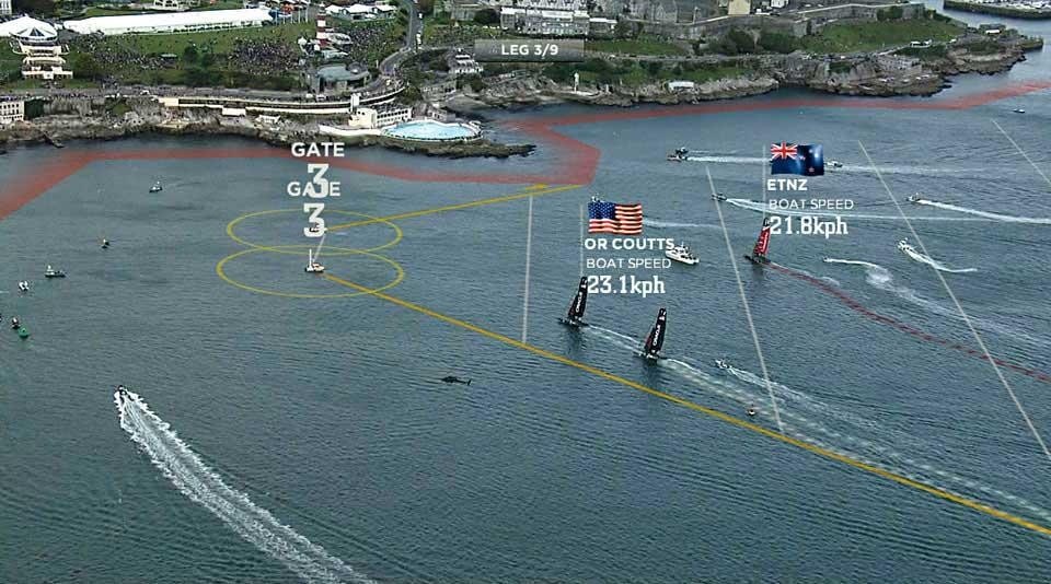
Thanks to the use of
advanced technology, the
LiveLine data collecting and
representation system allows
America’s Cup competitions
to be viewed with remarkable
informational detail
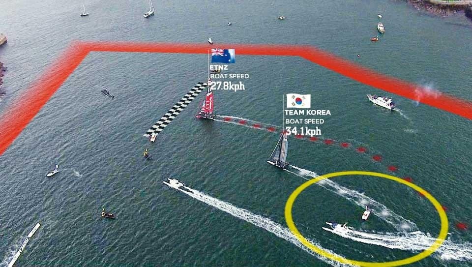
Thanks to the use of advanced technology, the LiveLine data collecting and representation system allows America’s Cup competitions to be viewed with remarkable informational detail
Similarly, AC Milan's Milan Lab interdisciplinary research unit sprinkle sensors all over their footballers during training, to measure their physiological performance. During matches, players are tracked in order to uncover kilometres run, successful tackles made, numbers of assists. Yet crucially this data's motivation is in reducing injuries; it does not tell you how good a player is, how good a team is.

So how do we go about getting the freeflowing, more subjective data that might better communicate life in buildings, football and business? One answer may be in looking at new types of sensors from leftfield. In the same way that risk insurers are using embedded sound detection sensors to listen to the deep acoustics of ageing buildings and infrastructure, we could surely find sensors to measure the movements of footballers that went beyond arguing for GPS chips in the ball. And built environments, too, can use the people in those environments to help generate the qualitative data they need to be information expressive systems.
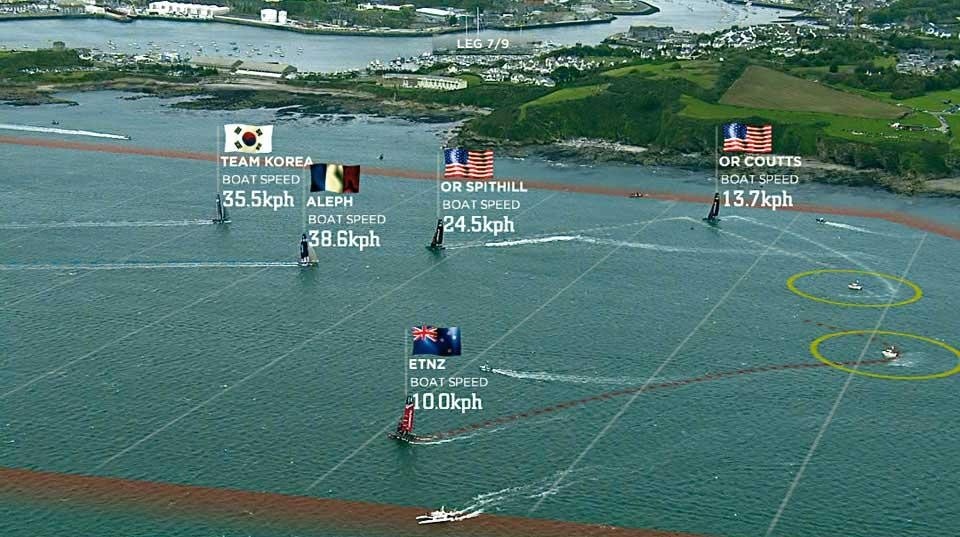
A detail of the data visualisations during America's Cup
Connecting these two worlds, would football analysis derive value from parametric models describing the interdependency between performative elements in buildings? Parametric models indicate how a change to one component of a structure causes ripples of changes through all the other connected elements, mapped across structural loads but also environmental characteristics, financial models and construction sequencing. FC Barcelona's activity is also clearly parametric in this sense. It cannot be understood through sensors tracking individuals but only through assembling the whole into one harmonious, interdependent system: the symphony and orchestra, rather than the midfield string section, or Lionel Messi as the first violinist.
A detail of the data visualisations during America's Cup
The answer, for both football and buildings, will emerge from a more holistic, performative sophistication in collection and visualisation, as a "total design".

Here, the multi-modal data display shows promise, involving the subtle overlaying of different types of data streams: live pictures, scores and analysis. Our media has tended to be very binary in terms of how visual and textual data merge, or how moving images and numeric data are experienced. Sports coverage is indicating another way forward. Ensuring human interpretation remains part of the live mix can offer a poetic edge that data will always struggle to match. Increasingly, broadcasters incorporate interaction from viewers and listeners into the mix of opinion, an open "bottom-up" system played off against the "topdown" of the presenters. The legendary American sportscaster Howard Cosell famously said, "Sports is human life in microcosm."

A screenshot of the
documentary film <em>Zidane:
A 21st Century Portrait</em> by
Douglas Gordon and Philippe
Parreno, 2006
A screenshot of the documentary film Zidane: A 21st Century Portrait by Douglas Gordon and Philippe Parreno, 2006
Perhaps because of this cultural aspect we can look to sport as an unlikely avant-garde of information design of complex systems, in prototyping a data driven culture, and in presenting a rich diversity of representation in harmony. We should explore visualisations for apps, media or built environments to offer many views of data, interpretation and presentation — and this qualitative view will have the multidimensionality required to engage all who are meant to understand. By visualising a many-media mix of images, numbers, materials and opinion, the diversity of modern experience can be better expressed using the data around us. Max Gadney (@AftertheFloodco), founder of After the Flood

[1] Intriguingly, as well as a player and manager for Dynamo Kyiv, Valeriy Lobanovskyi was also a student of heating engineering at Kyivan Polytechnic Institute. Kyiv was the centre of the Soviet computer industry, and had the first cybernetic institute in the USSR in 1957, and the first PC by the mid- '60s. The relationship between data-driven management, sports and buildings goes back further than we think.

Latest on Design

Latest on Domus

Read more
China Germany India Mexico, Central America and Caribbean Sri Lanka Korea icon-camera close icon-comments icon-down-sm icon-download icon-facebook icon-heart icon-heart icon-next-sm icon-next icon-pinterest icon-play icon-plus icon-prev-sm icon-prev Search icon-twitter icon-views icon-instagram