

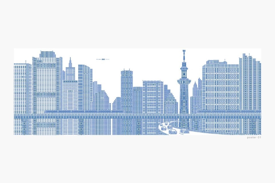
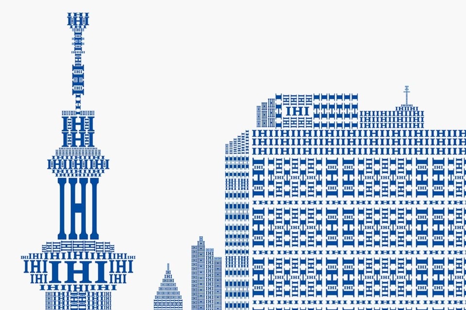
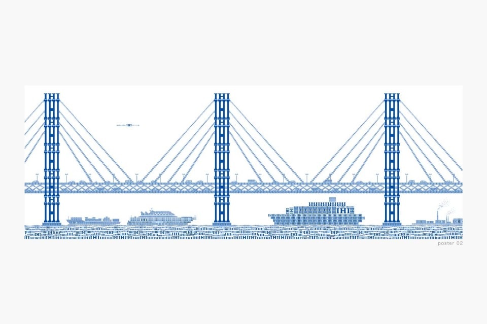
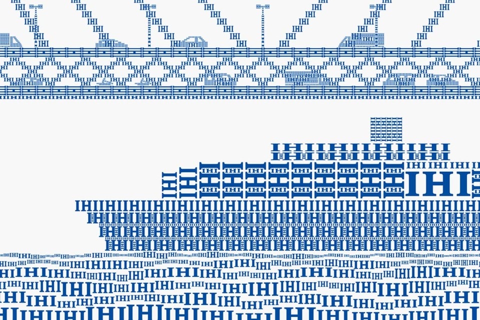
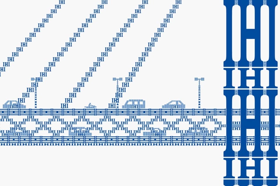
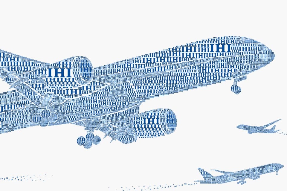
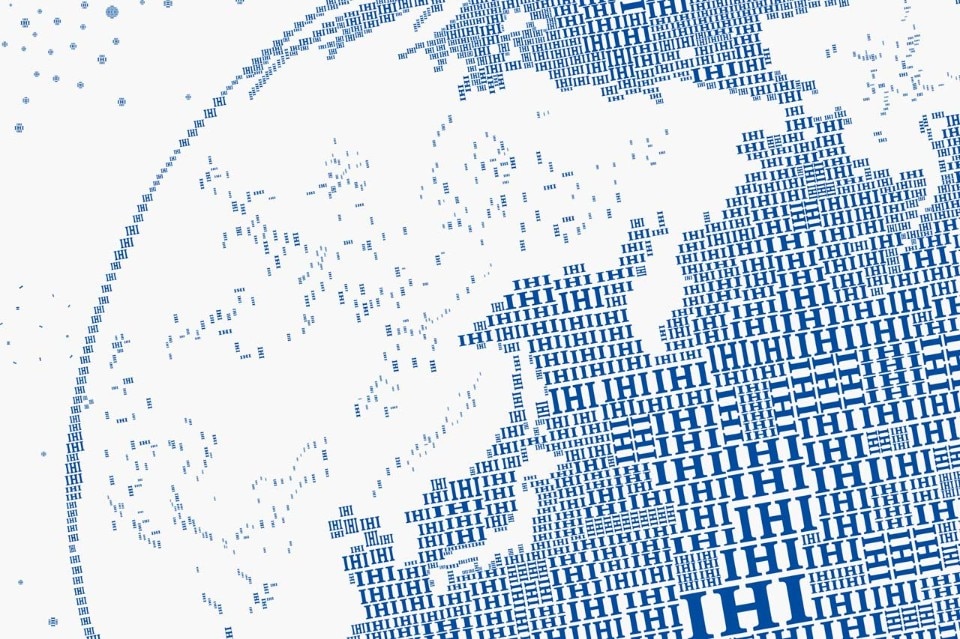
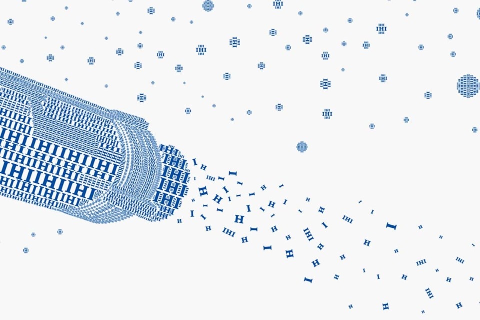
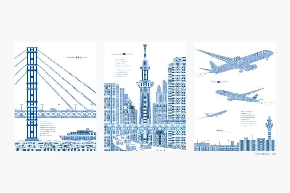
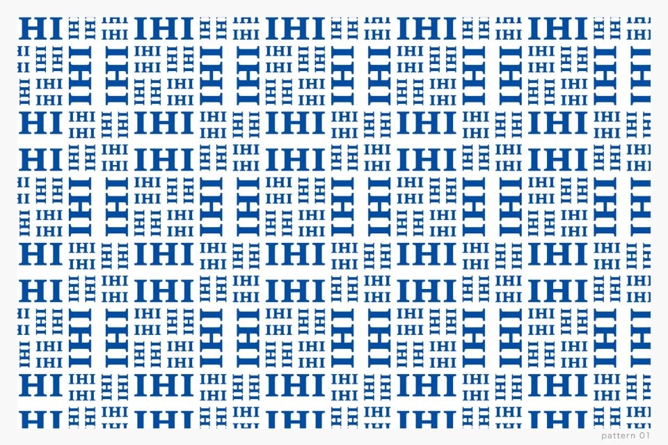
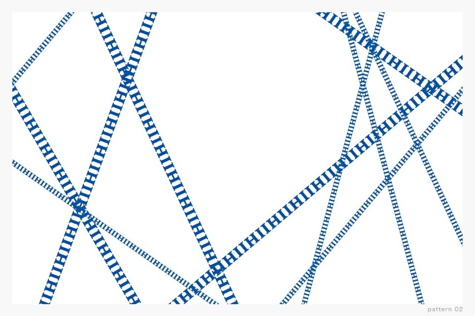
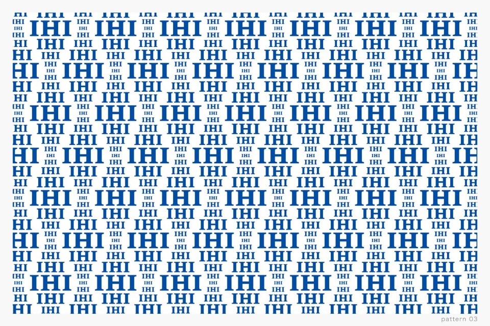
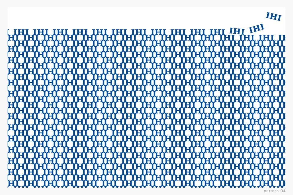
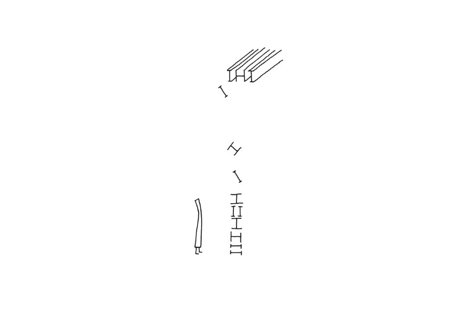
In his advertising strategy for the company, Nendo decided on an image based solely on its company logo; the letters ‘IHI’ in blue font. This idea originally came about from the resemblance of the logo letters to the steel I- and H-beams used in construction. Just as structural steel is used to construct buildings, this concept allowed us to put together a variety of visual images. Each image comes with a single statement.
The corresponding TV commercial is also composed entirely of the logo, with no voiceover or captions whatsoever. It is an animation piece, made through the painstaking process of maneuvering each of the 2000 logos on screen by hand.


IHI company ad 2015
Design: Nendo
Creative Direction: Oki Sato
Art Direction: Oki Sato + Hideto Yag