The whole world, mapped

To celebrate its 128 years, National Geographic has united some of its most interesting infographics in a book by Taschen that shows how the magazine has refused to let software hijack its visualisations.

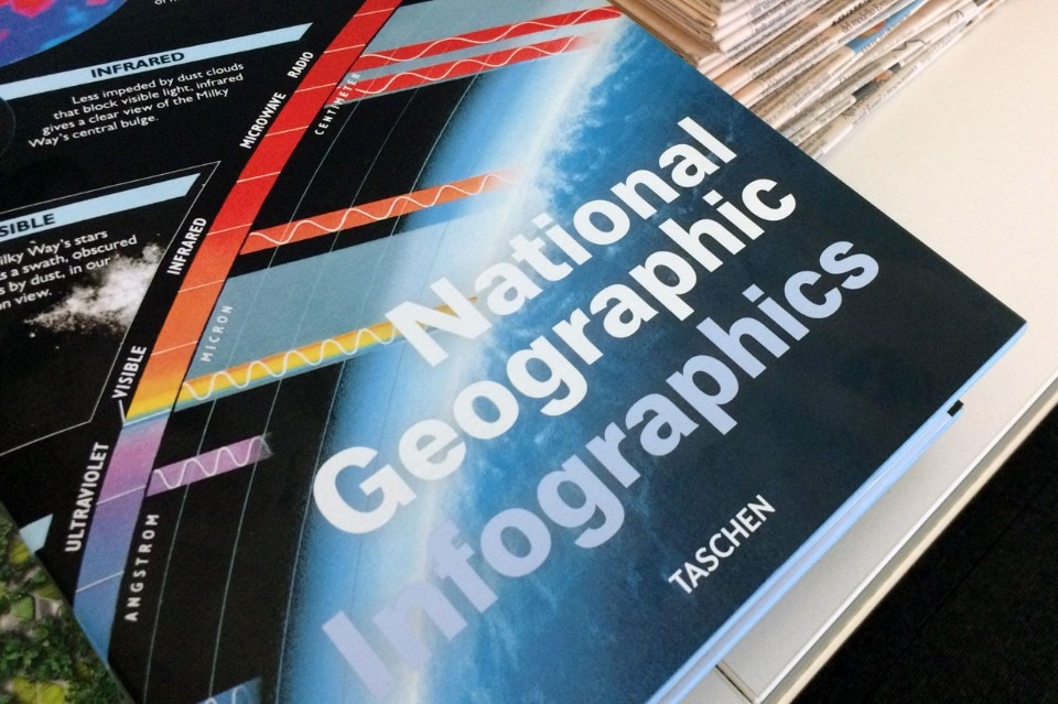
National Geographic Infographics
Julius Wiedemann, National Geographic Infographics, Taschen, 2016, 480 pages.


For many years now, one of the unattained aims of the technological evolution has been to dominate information overload, the enormous and growing quantity of data produced and distributed every second throughout the world. The problem was already present in 1945, when the American engineer Vannevar Bush conceived the idea of a complex instrument that aimed to solve it. He called it Memex (combining Memory and Extension). Never built, only designed, the Memex was a kind of mechanised desk to help manage documents by combining them in a non-linear way similar to the way our mind functions. The mind associates different concepts based on connections (links), and so the idea was a forerunner of the hypertext, the core of the Wold Wide Web. With innovative instruments, reasoned Bush, it would be possible to give new forms to knowledge, governing in some way the surfeit of information. Now it is clear that the Web has not only failed to solve the problem, but also made it much worse.
 

Many years before Vannevar Bush had his idea, in October 1888, a means was born that on the surface had a whole different aim (exploring and explaining our world) but that would find itself facing very similar problems to the ones described by the engineer precursor of the hypertext, and solve them, often brilliantly. We are referring to the National Geographic Society’s magazine, which in celebration of its 128th birthday has published the book National Geographic Infographics, in which it unites the most interesting infographics seen in its pages over the decades.
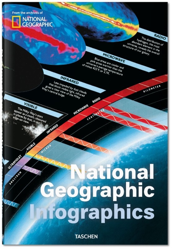
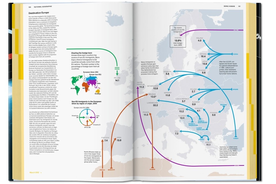
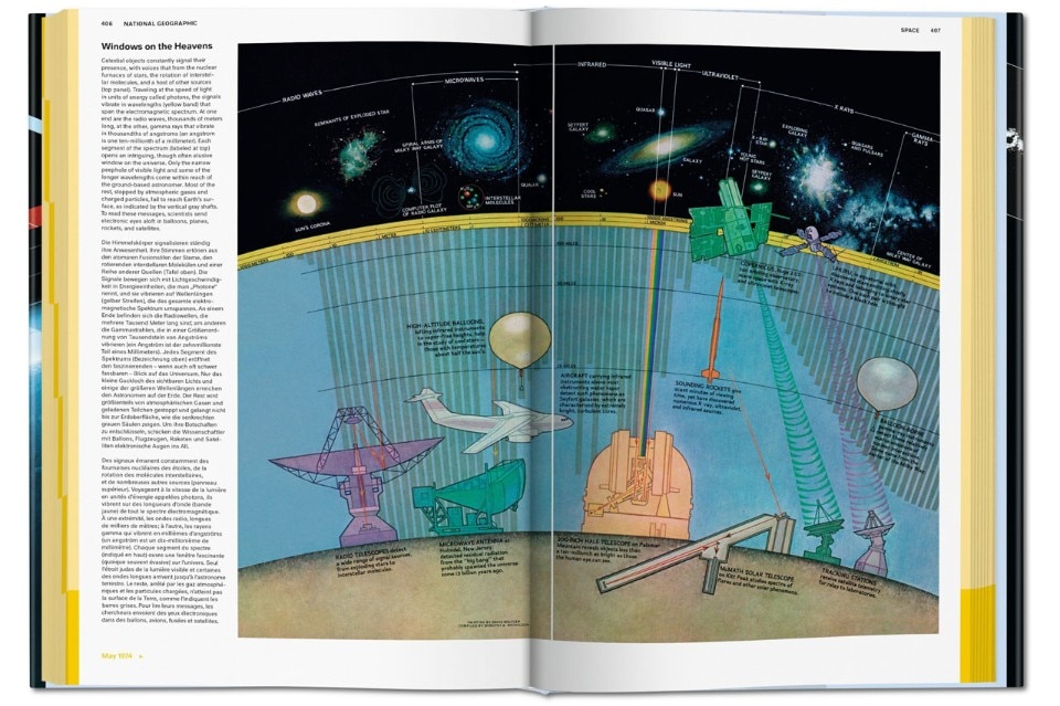
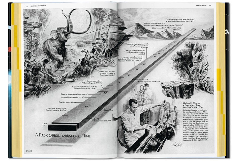
The book is considered an “XL” format by Taschen, measuring 24.6 x 37.2 centimetres and counting 480 pages. It is beautifully presented, editorially as well as graphically, and divided into seven sections: History, The Planet, Being Human, Animal World, World of Plants, Science and Technology, and Space. An exhaustive final index synthesises the publication dates and subjects of the images. The first illustration, featured during the magazine’s inaugural year, is a colour representation of storm activity off the coast of Nova Scotia. The last is a complex reconstruction of the melting Arctic ice cap. In between, there are minute descriptions of monuments such as Trajan’s Column in Rome (four pages packed with details and explanations); portrayals of the invisible structure of black holes, dark matter, and vital functions such as the sleep cycle.
National Geographic Infographics
Julius Wiedemann, National Geographic Infographics, Taschen, 2016
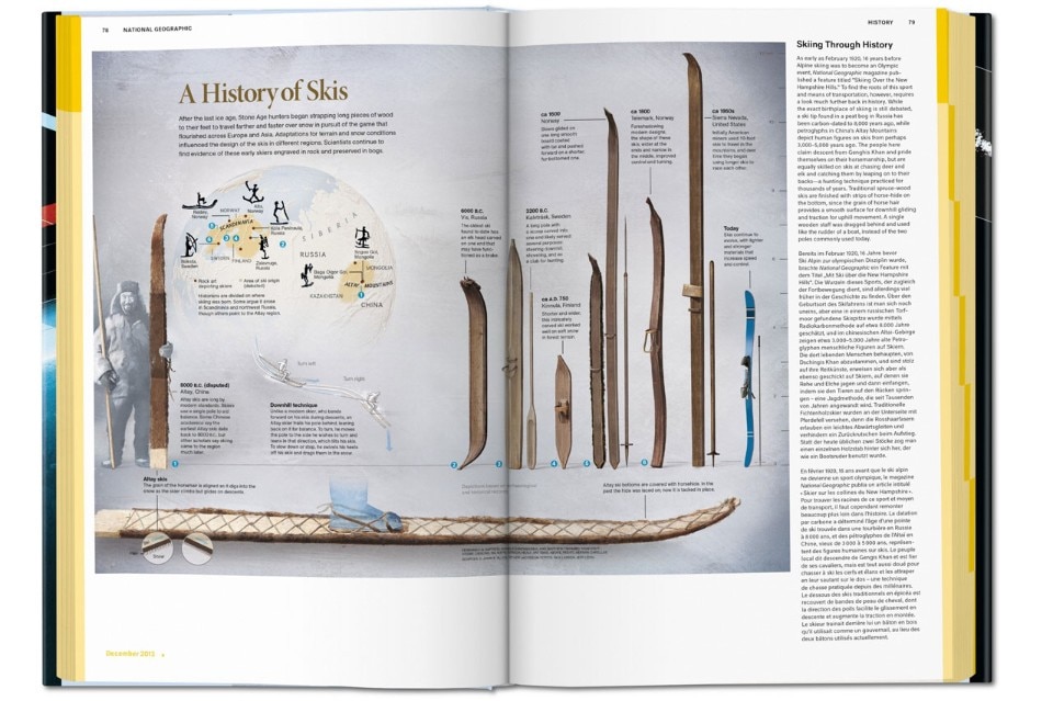
During its early years, the prestigious magazine collaborated with Alexander Graham Bell, the inventor of the telephone. From the beginning, it made use of graphic design to simplify information and make it more accessible. Detailed geographic maps were joined by a broader approach in which pictures were used to represent many different types of content – the interior of a pyramid or the history of skis (where we learn the first ones go back to 8,000 BC). The illustrational style favoured visual clarity, offering readers an immediate overview of the subject matter. Images drawn by Fernando Baptista are alternated throughout the issues with more complex illustrations where a large quantity of information is graphically condensed without ever compromising the aesthetic quality of the result.
Nigel Holmes, an illustrator and graphic designer at National Geographic, explains in the introduction to the book how the magazine refused to get carried away with graphic-art excesses such as three-dimensionality. In other words, it did not allow for software to dictate the standards of its illustrations, as unfortunately often happens. If an effect is technically possible, illustrators tend to get carried away and exaggerate, resulting in a loss of originality by adopting a type of uniformity in which it is difficult to distinguish one editorial product from another. At National Geographic, precisely the opposite happened. The choice to narrate facts by means of graphic design led the magazine to develop a very particular style, and browsing the book gives continual confirmation of this.
The most important recognition comes from readers. In 1988, the publication’s centennial year, there were 14 million of them. Today the number remains even higher than that record, with the magazine printed in 43 languages and diffused through digital channels. Nowadays, the infographics include different genres, from the contours of a region, to maps with three-dimensional relief, and satellite images provided with precise explanatory captions. The magazine maintains a certain distance from data visualisation, meaning the use of graphics to give a viewable form to highly complex databases in order to render them comprehensible to the public. For data visualisation, the illustrator works with the indispensible aid of software, and the results can be aesthetically pleasing, but not always easy to understand.
It is a demanding task to explore this kind of picture so full of information, often so layered that it takes interactive technology to peel back the levels. For the moment, National Geographic has taken the decision to keep the accent on images that can be comprehended at a glance (see for instance the depiction of the Mose anti-flooding project for Venice on page 167). Perhaps in the future there will be more room for experimentation with data visualisation, a concrete way in which technology can prove useful in dominating the informational chaos and crown engineer Bush’s dream. As for the magazine’s history, it demonstrates how the sketch of a good illustrator can help us understand (and make sense of) the world better than a computer can.
© all rights reserved

Latest News

Latest on Domus

Read more
China Germany India Mexico, Central America and Caribbean Sri Lanka Korea icon-camera close icon-comments icon-down-sm icon-download icon-facebook icon-heart icon-heart icon-next-sm icon-next icon-pinterest icon-play icon-plus icon-prev-sm icon-prev Search icon-twitter icon-views icon-instagram