10 years of Mutina

Mutina celebrates its tenth anniversary with several novelties. Among them are two collections by Bouroullec and Grcic and a video by the Spanish filmmaker Alberto Moya.

Konstantin Grcic, Numi, Mutina
Mutina celebrates its tenth anniversary launching the first advertising campaign, a new website, the Mutina Journal and its first steps in the field of contemporary art with the intention of developing some special projects in collaboration with some of the biggest contemporary artists.
 la campagna pubblicitaria sviluppata da Scheltens & Abbenes per Mutina
Top: Konstantin Grcic, Numi, Mutina. Above: The adv campaign by Scheltens & Abbenes for Mutina
The Mutina Journal was born to be an insight into the Mutina world, a way for people who have long been fans of the company, as well as people who had never heard of it, to discover interesting facts and see what most represents the company. Everything begins with an interruption is the title of the shortfilm directed by Spanish filmmaker Albert Moya to celebrate this important anniversary: “I liked the idea of using such an important statement to work on the concept of the film. The HQ building has a lot of personality and we knew from the very beginning that it was going to influence the whole aesthetic of the film, with that elegant yet industrial feeling of the early 70’s. The key to look at the architecture coexisting with the rest of the elements of the film, was the choice of black & white”.
The two new collections are Rombini, from a collaboration with French designer duo Bourollec, and Numi, the first Mutina collaboration with German designer Konstantin Grcic.
The adv campaign by Scheltens & Abbenes for Mutina

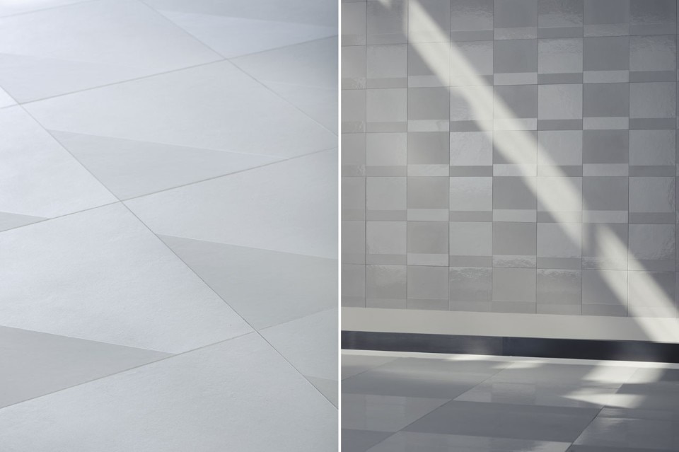
“Rombini is an alphabet of shapes and colors. The project consists of three models: tile, mosaic and relief elements. It is a collection that offers a complete solution, offering different combinations; rhythmic and colorful connections ranging from the tile to the mosaic, from the mosaic to the relief, from the relief to the tile” Bouroullec brothers say.

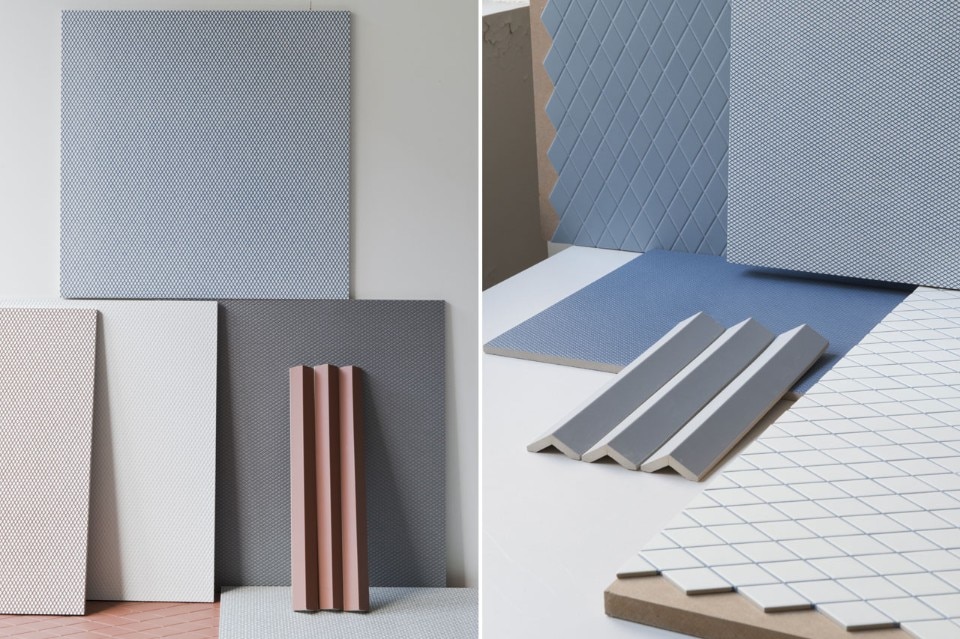
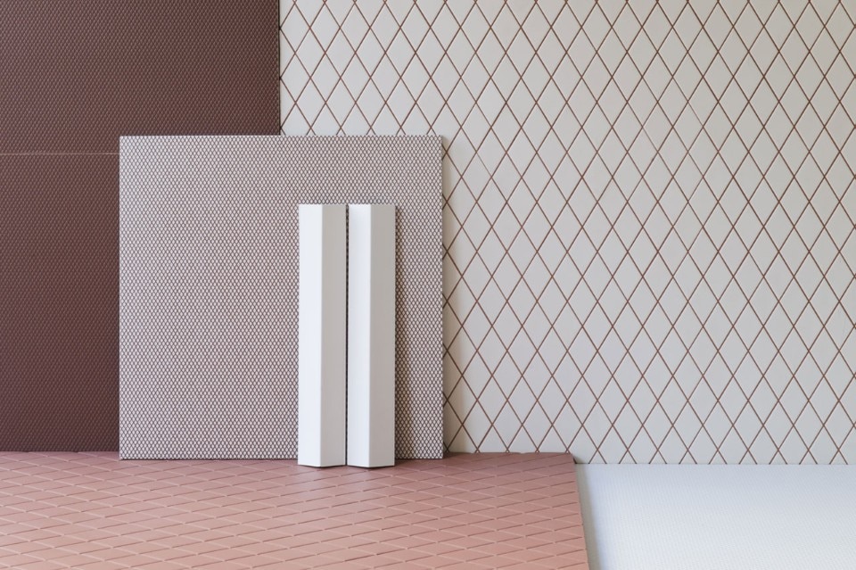
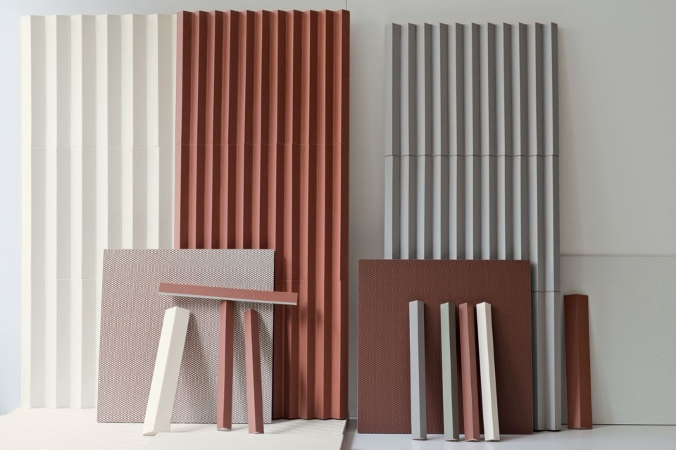
Declined in the symbolic Bouroullecs’ colors, the shape of the rhombus is told through elements in communication with each other, to become story and exchange. Rombini is a real interior design project, based on colour and composed by three elements: Carré, Losange and Triangle. Carré, 40x40 rectified slabs in glazed porcelain stoneware, are produced on a mould made of many little embossing diamonds on a matt surface
which gives a strong ceramic identity to the collection.

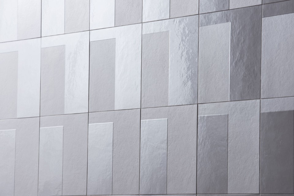
Carré is available in two versions: Uni, where colour is evenly distributed throughout the whole slab, and Light, where colour is used to underline the white diamonds outlines. With Losange, the shape of the rhombus becomes bigger and turns into a chip of a mosaic. Made of double charge porcelain stoneware, each piece is installed on 27,5x25,7 cm sheets.

The chromatic range results to be deep and intense, thanks to the matt surface which gives a natural character to the product. Even in this case the element is available in two versions, through the usage of matching or with contrasting grout, for a stronger vibration. Thanks to Triangle, the shape of the rhombus is interpreted in its three-dimensional shape, in order to create games of lights and darkness on the surface: the elements, realized in Large and Small versions, seem to arise from the floor and to carry on the wall covering.

Ronan & Erwan Bouroullec, Rombini, MutinaRonan & Erwan Bourolullec, Rombini, Mutina
Ronan & Erwan Bouroullec, Rombini, Mutina

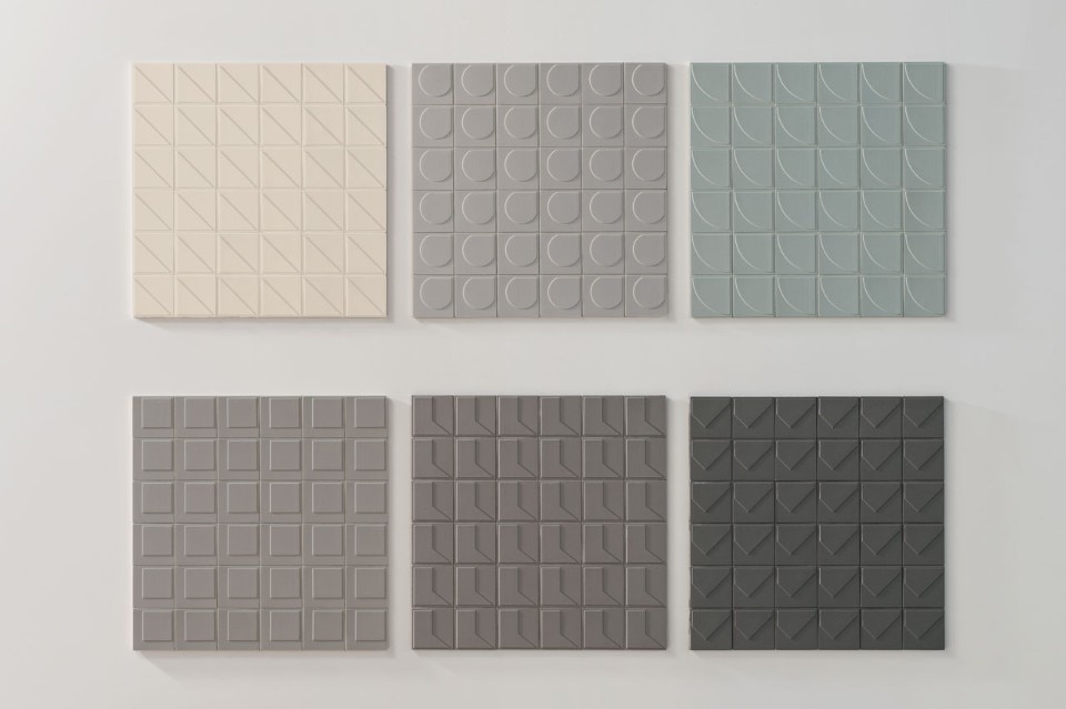
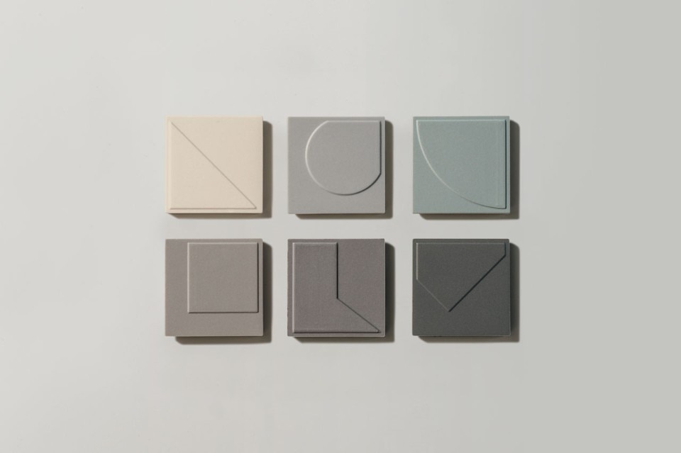
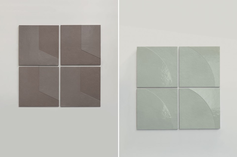
“Ceramics! Working at my very first collection for Mutina, I’ve come to value the beauty of this simple and ancient material. A lump of clay that becomes floor, coating. The idea of matter as something composed of so many units, is really fundamental. A philosophical concept as much as a biological fact. The ceramic tile simply represents this: a small unit which, once multiplied, turns into something larger than the sum of its parts” Konstantin Grcic says.

The collection consists of squared tiles – 30x30 cm and 60x60 cm – with a different, partially glazed geometric form, in six different colors. These shapes create a pattern which magnifies into architecture.

Numini, in a smaller size – 5x5 cm – are based on the same principle, but they represent the sculptor soul of the collection, being characterized by a pattern that this time is created by the embossment and not by the glaze. The 6 geometries are carved on an extra matt background which reminds of Numi’s soft cement, emphasized by a smooth finishing and by the usual 6 dusty shades: light three-dimensional effects which create a linear movement. Mosaic pieces in size 5x5 cm, made in homogenous porcelain stoneware, are assembled with glue on sheets in 30x30 cm. In their arrangement every geometric shape is settled in exactly the same way to emphasize the lights and shadows. As in a mass production. The geometry’s embossment on the tile, around 0,6 mm of size, allows the coating to create an evocative effect.
For the launch of the first advertising campaign Dutch duo Scheltens & Abbenes have created three different architectural compositions of great visual impact to express the characteristics of the collections that brought Mutina success.

September 28 – October 2, 2015
Ceramiche Mutina
via Ghiarola Nuova 16, Fiorano, MO

Latest on News

Latest on Domus

Read more
China Germany India Mexico, Central America and Caribbean Sri Lanka Korea icon-camera close icon-comments icon-down-sm icon-download icon-facebook icon-heart icon-heart icon-next-sm icon-next icon-pinterest icon-play icon-plus icon-prev-sm icon-prev Search icon-twitter icon-views icon-instagram