Swiss Style

The exhibition at the Museum für Gestaltung traces how Swiss Style spread internationally and, with a number of contemporary works, confirms that it is still topical.

Benno Wissing, Signaletik Flughafen Schiphol, Amsterdam, 1960er, © Paul Mijksenaar Archives, Amsterdam
Plain, functional graphic design is, in fact, extremely topical. Amidst the visual opulence that currently surrounds us precisely condensed posters, clearly structured book design or the sign-age systems used in airports and underground metro networks seem almost spectacular. The demand for new typefaces that are simple and easy to read on a screen has grown rapidly in recent years.
With Helvetica and Univers typeface designers from Switzerland conquered the world from the 1960s onwards, and reduced design under the name Swiss Style succeeded in establishing itself internationally.
b>Above, left</b>: Josef Müller-Brockmann, Moins de bruit, 1960, Museum für Gestaltung Zürich, Poster Coll-ection. <b>Right</b>: Wim Crouwel, SM ─ Robert Rauschenberg, 1968, Museum für Gestaltung Zürich, Poster Collection
Top: Benno Wissing, Signaletik Flughafen Schiphol, Amsterdam, 1960er, © Paul Mijksenaar Archives, Amsterdam. Above, left: Josef Müller-Brockmann, Moins de bruit, 1960, Museum für Gestaltung Zürich, Poster Coll-ection. Right: Wim Crouwel, SM ─ Robert Rauschenberg, 1968, Museum für Gestaltung Zürich, Poster Collection

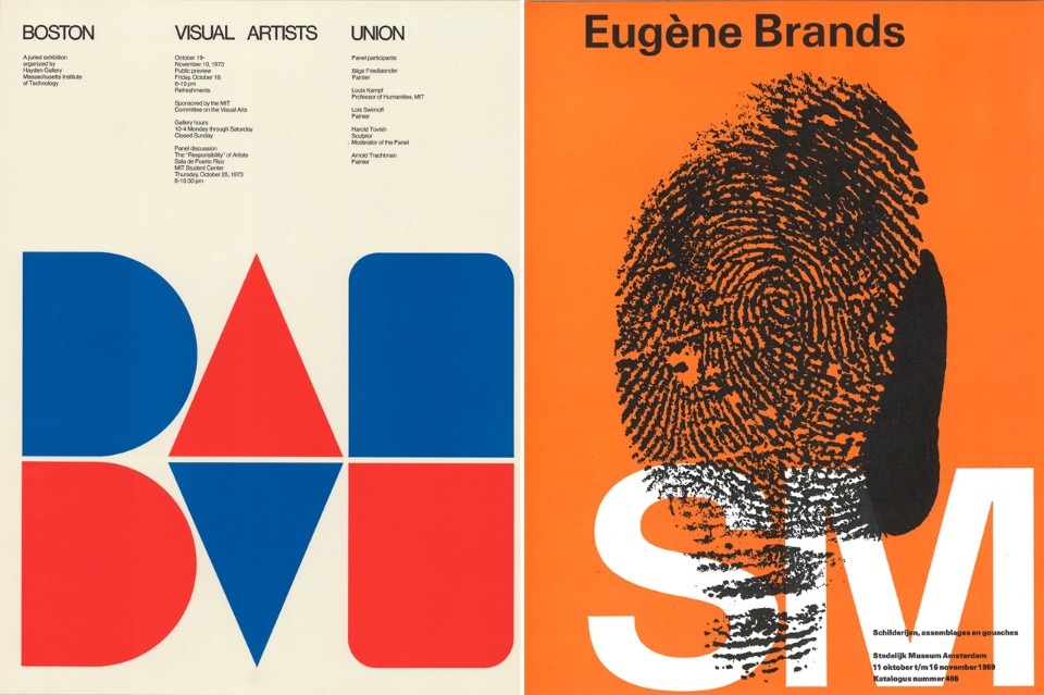
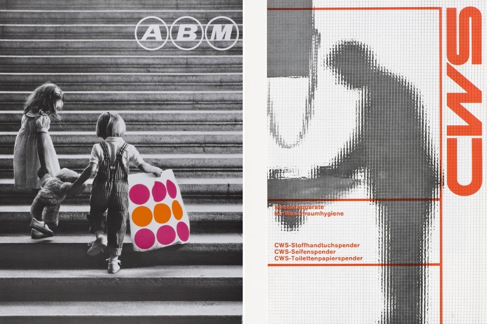
Josef Muller-Brockmann, Karl Gerstner or Armin Hofmann were the father figures of the pioneer-ing movement that propagated the Swiss Style. This movement was marked by an abstract or constructive repertoire of forms. The characteristics are: a clearly structured system of text and images, the use of sans serif typefaces and a general tendency towards abstraction and reduction. Instead of illustrations symbols are used.

In the 1960s this modern style not only had its finger firmly on the pulse of the time, it also responded to the growing need of large businesses and state institutions to communicate speedily, universally and under-standably. The design tasks circled essentially around questions about the corporate identity of firms and institutions and the development of complex symbol systems that could be read quick-ly and unambiguously by an increasingly mobile society. Alongside the USA, it was above all graphic designers in Holland, England and France who incorporated ideas from Swiss graphic design in their own, local ways of expression and developed them further.

<b>Left</b>: Josef Müller-Brockmann, Überholen ...? Im Zweifel nie!, 1957, Museum für Gestaltung Zü-rich, Poster Collection. <b>Right</b>: Gredinger, Gerstner + Kutter, Audi Super 90, 1965, Museum für Gestaltung Zürich, Poster Collection
Left: Josef Müller-Brockmann, Überholen ...? Im Zweifel nie!, 1957, Museum für Gestaltung Zürich, Poster Collection. Right: Gredinger, Gerstner + Kutter, Audi Super 90, 1965, Museum für Gestaltung Zürich, Poster Collection
The exhibition offers a perspective of the international context of modern graphic design. Along-side stylistically definitive works by designers from Switzerland, important groups of works by Wim Crouwel, doyen of the international style with a Dutch touch, can be seen, as well as works by Massimo Vignelli for the legendary signage of the New York City Subway System) or advertisements by Pirelli. These examples illustrate how the minimalist aesthetic developed into an international style.

17 April – 26 July 2015
Swiss Style – International Graphic Design
curated by Karin Gimmi
exhibition design Christian Horisberger
Museum fur Gestaltung, Schaudepot
Toni-Areal, Pfingstweidstrasse 96, Zürich

Latest on News

Latest on Domus

Read more
China Germany India Mexico, Central America and Caribbean Sri Lanka Korea icon-camera close icon-comments icon-down-sm icon-download icon-facebook icon-heart icon-heart icon-next-sm icon-next icon-pinterest icon-play icon-plus icon-prev-sm icon-prev Search icon-twitter icon-views icon-instagram